Project Type
Product Design, UX/UI Design
Rol
Lead Brand Web Designer
Deliverables
Product Design, Project Strategy, CMS Components
Problem Statement
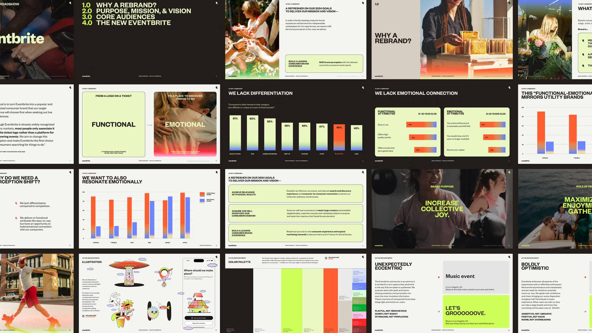
Eventbrite embarked on a bold global rebrand led by Buck.co, and as a result, the company needed to reflect its refreshed brand across key markets, including the US, Canada, Australia, New Zealand, Ireland and the UK. The challenge was to redesign the platform to improve brand consistency and increase conversion rates for sign-ups and sales leads.
Team composition
Growth Manager, Content Writer, Design System team, Engineers and Project Manager.
The vision
Leadership initially wanted to focus solely on a B2C marketing campaign and a consumer app launch, but through advocacy with the Brand Studio Team, we expanded the scope to include marketing landing pages targeting both B2B and B2C audiences.
With a tight deadline of just four months (from December 2024 to March 2025), the project demanded agility, precision, and relentless focus.
Leadership initially wanted to focus on a B2C campaign around the consumer app launch, but through advocacy with the Brand Studio team, we expanded the project scope to include marketing landing pages targeting both B2B and B2C audiences.
With a tight deadline of just 4 months (from December '24 to March '25), the project demanded agility, precision, and relentless focus.
Framing the impact
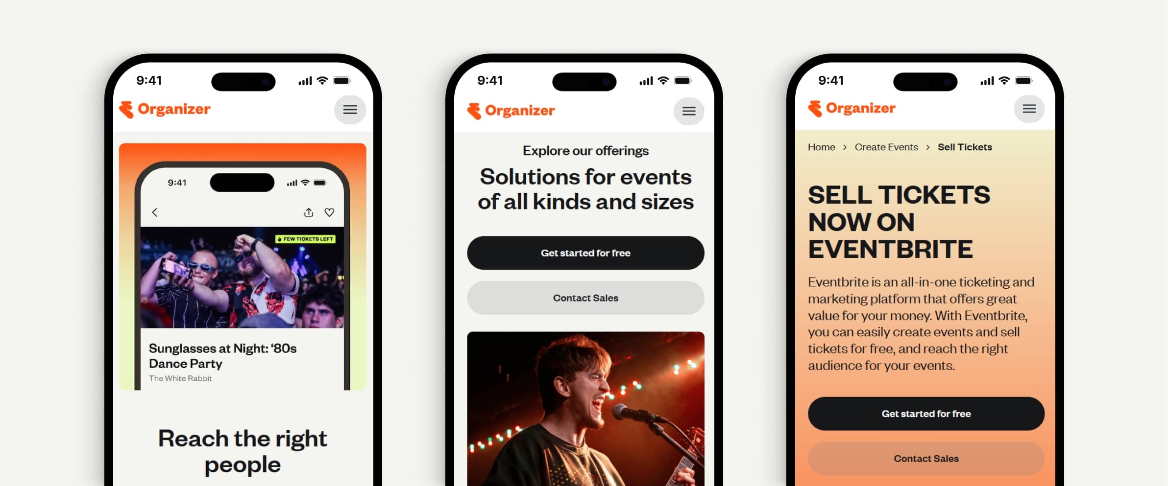
Knowing that the marketing landing pages will be the first touchpoint for many users with Eventbrite, we focused on ensuring a consistent experience across the whole user journey from the begining.
Using the new brand language provided by Buck.co as a jumping-off point, we injected key web and product features to better communicate Eventbrite's value proposition to each audience.
Brand guidelines usually focus on the what and why, so we focused on building a design system that closed the gap between the Product and Marketing org. Improving team efficiency when building web assets, as well as ensuring a cohesive brand experience.
The process (in a nutshell)
Understand the updated visual direction by immersing myself with the new brand guidelines, ensuring a consistent user experience across all digital touchpoints.
Identified opportunities for both the business and users by analyzing performance metrics (such as conversion and bounce rate), and running stakeholders interview discovering friction points with content publishing.
Secured stakeholders buy-in by facilitating an alignment session and defining a web design strategy.
Worked on the redesign addressing pain points that were mapped and prioritized.
Conducted A/B tests, validating design assumptions and seeing a measurable increase in engagement and task completion rate.
Partnering with engineers to implement the new modules into the CMS.
Coordinating with cross-functional teams (Growth and Product Design) to outline opportunities and goals for a v2 release.
Turning vision into traction
Impact
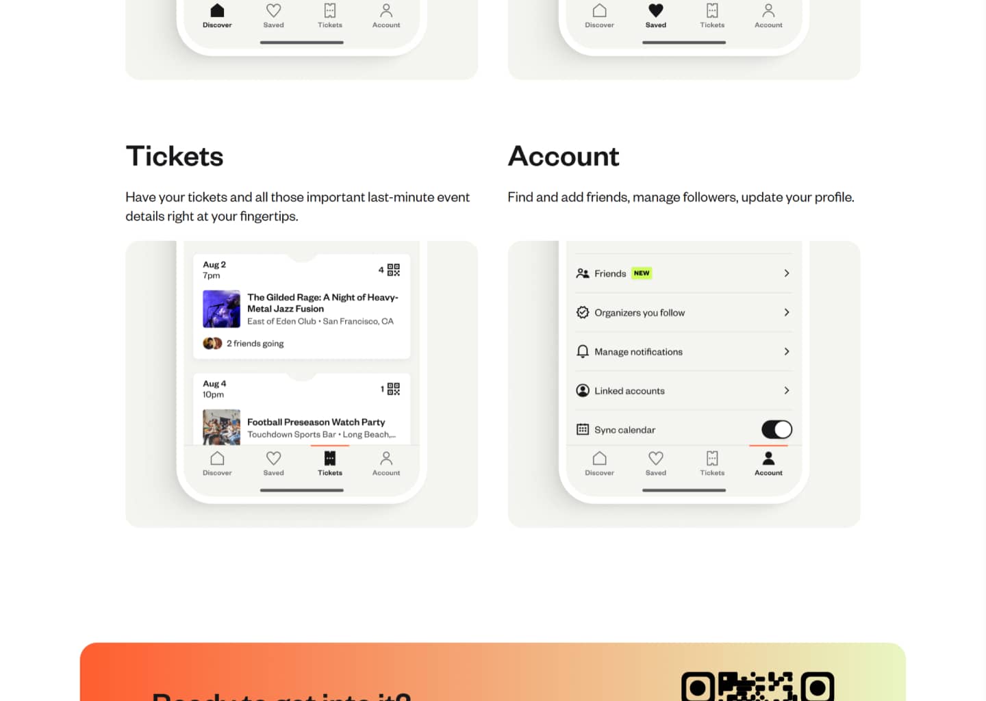
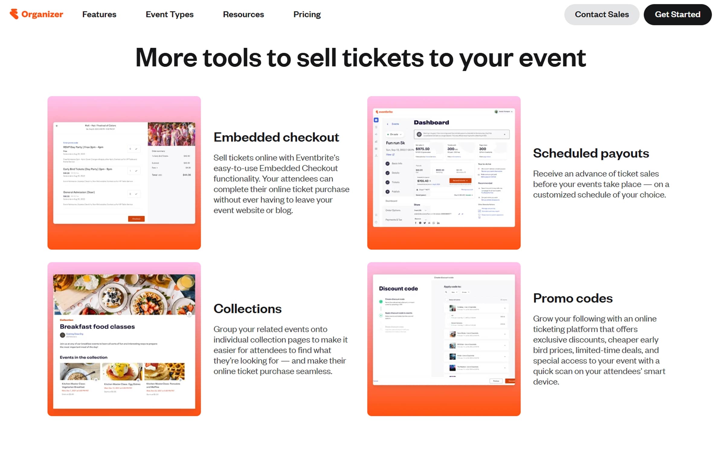
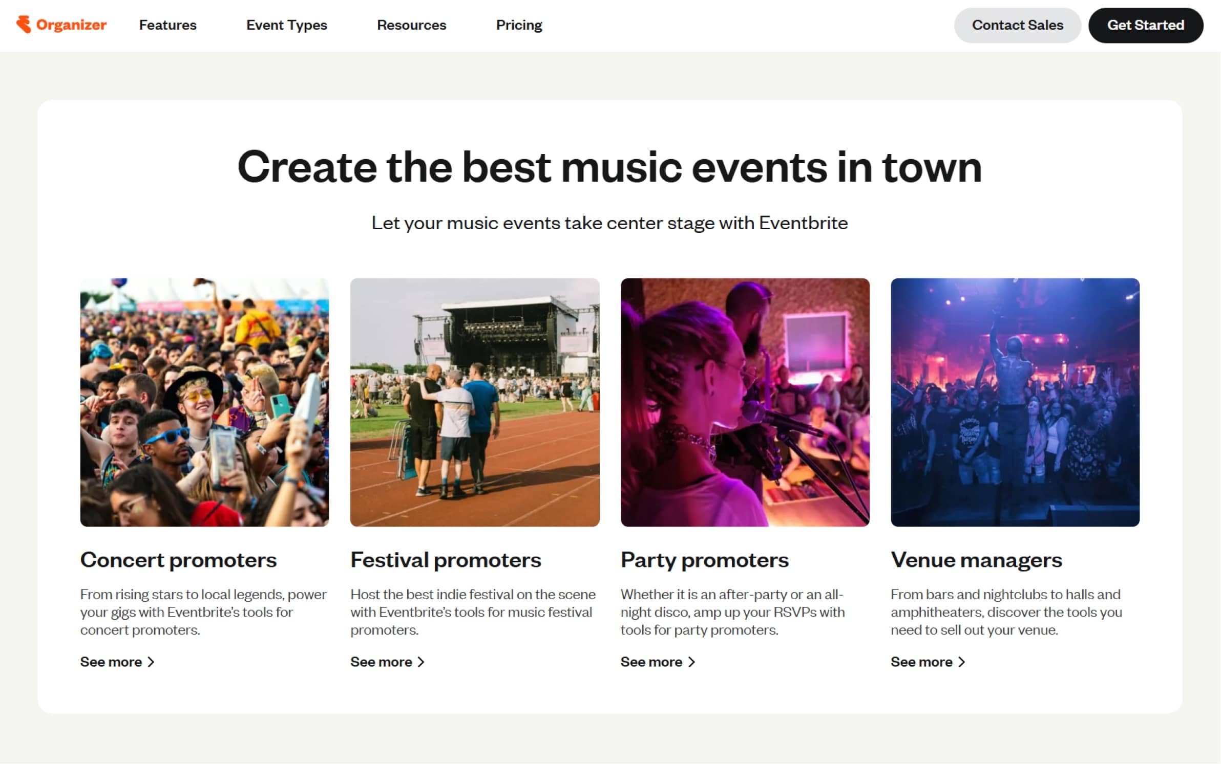
Ensured a seamless Product design for both B2B/B2C audiences through the development of more than 16 components, an a reimagined navigation pathways.
Crafted comprehensive brand guidelines for web usage, including color schemes, copy tone, and imagery recommendations to align with the company’s global new brand.
45%
Increase in Sign-Ups
219%
Sales Lead Generation
180+
Pages redesigned
6
Markets covered
Reflections and Learnings
On one hand, coming out of this project, I can see how it honed my ability to lead complex rebranding initiatives at scale while safeguarding brand integrity and UX quality. Advocating alongside the Brand Studio team to expand the rebranding scope to include a release for both B2B and B2C audiences was not only an advocacy victory but also a valuable lesson in leadership.
On the other hand, close partnerships with engineering sharpened my skills in proactive design handoffs and real-time quality assurance during development cycles. The improvements in conversion and lead generation underscored the importance of anchoring design decisions in data, as well as the need to advocate for iterative enhancements in large-scale design projects.
We had to make a few trade-offs along the way, in the way of how we were going to use certain visual elements (namely font treatment and colors). Serving as a bridge between the Brand Studio team and other cross-functional partners meant I had to advocate in each scenario for solutions that met the needs of both groups.